Web Admin For Ecommerce Dashboard

MallToGo: Multi-Vendor E-commerce Dashboard

Revamped the product page to enhance usability and efficiency.

My Contributions

Qualitative research

Competitive analysis

User interview

Usability Study

Flow diagrams

Wireframes

High-fidelity UI

Prototype

What
Web-based ecommerce vendor dashboard
Why
Increase product page usability and UI efficiency
Role
UI/UX Designer
Category
E-commerce, admin dashboard

Conducted a walkthrough of the existing product to identify areas for improvement

To gain insight into potential users’ perspectives, I conducted subjective and objective qualitative research and a competitive analysis, as I lacked prior online sales experience.

Competitive analysis

I analyzed the four most popular eCommerce site builders, focusing on the product uploading process and combining our experiences with the current product to find appropriate solutions.

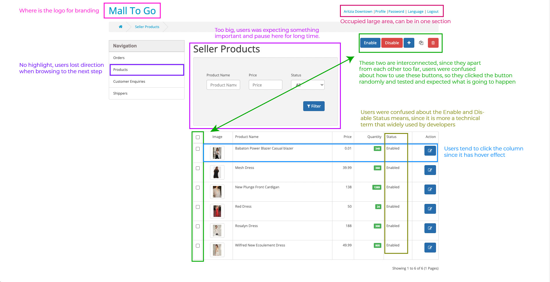
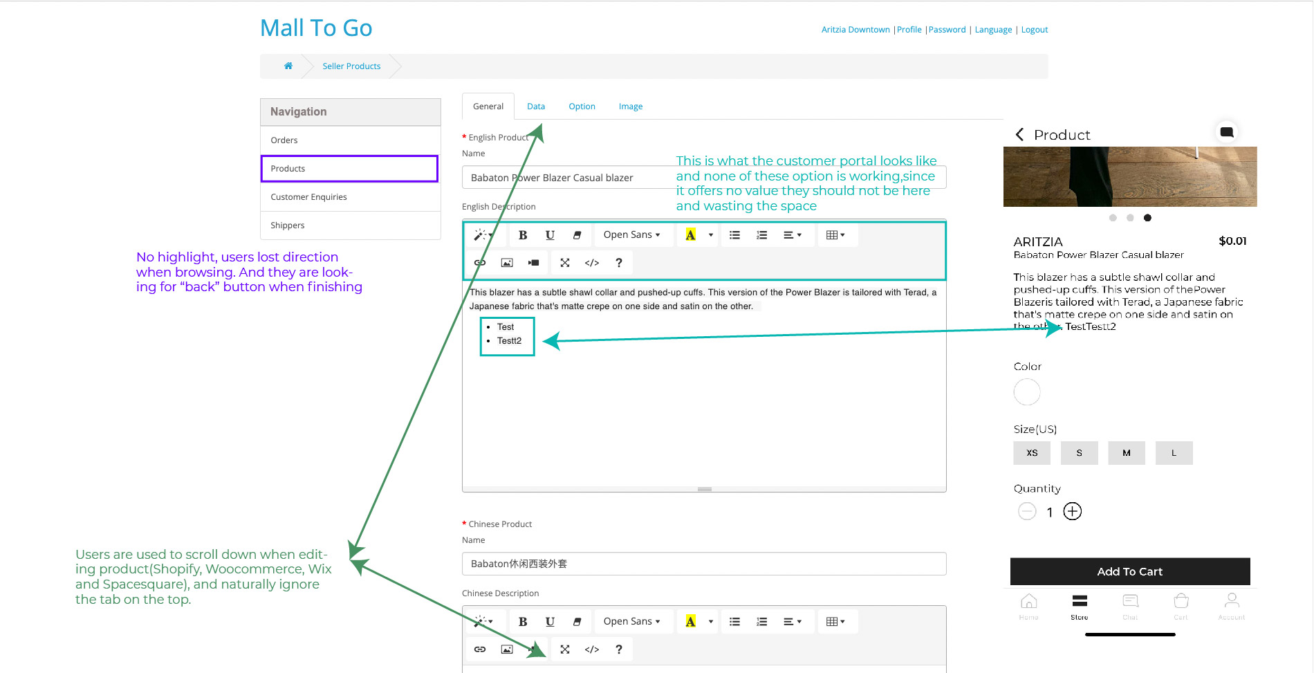
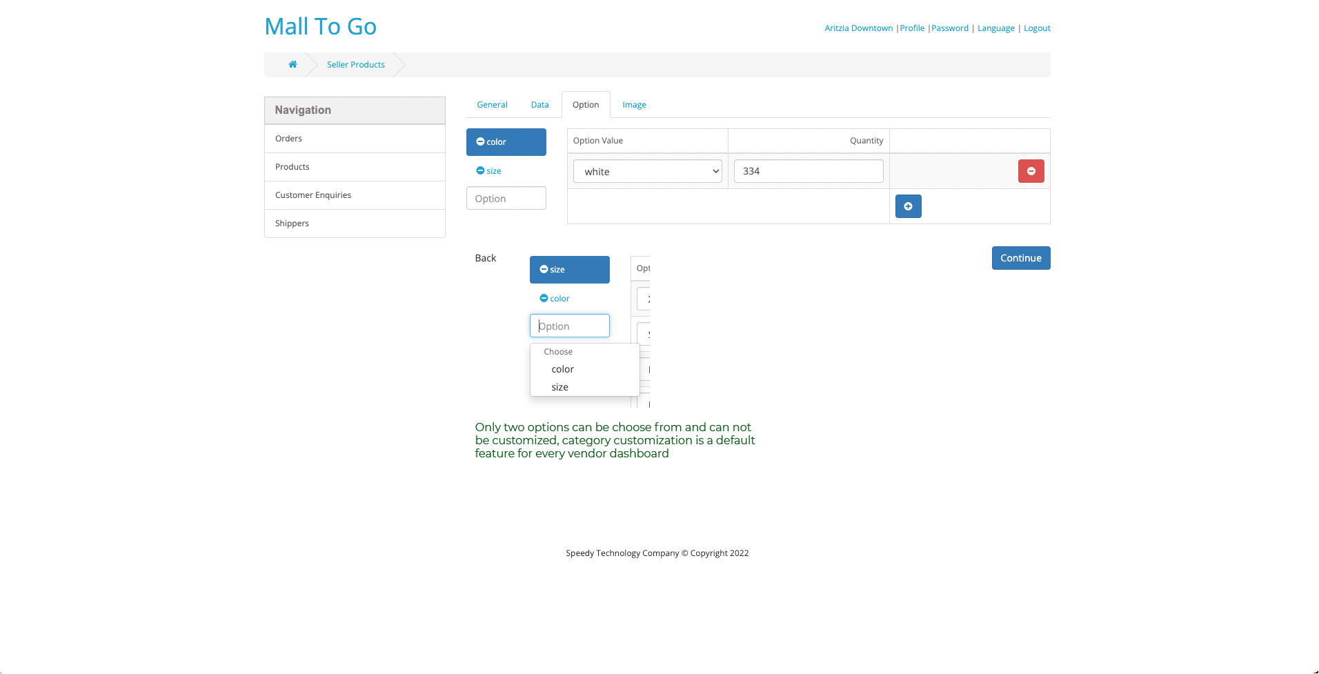
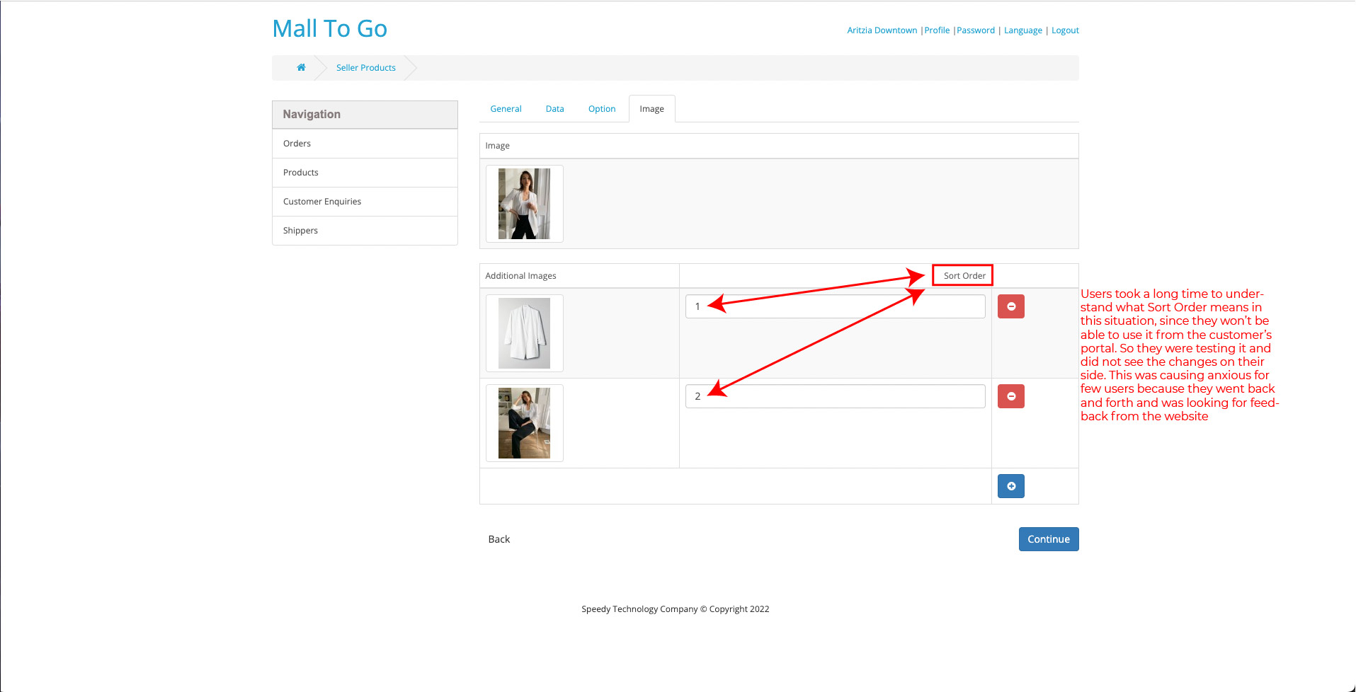
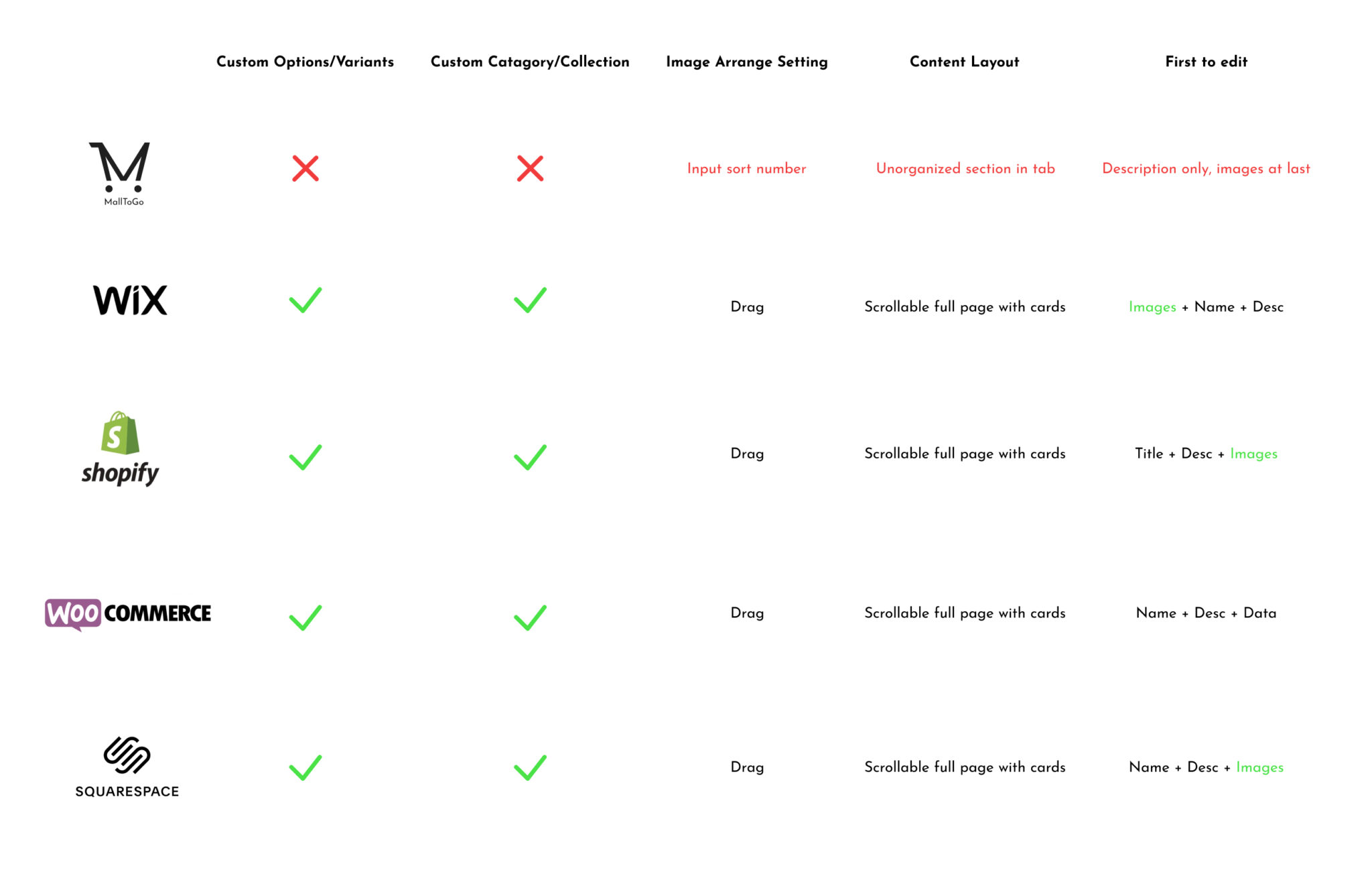
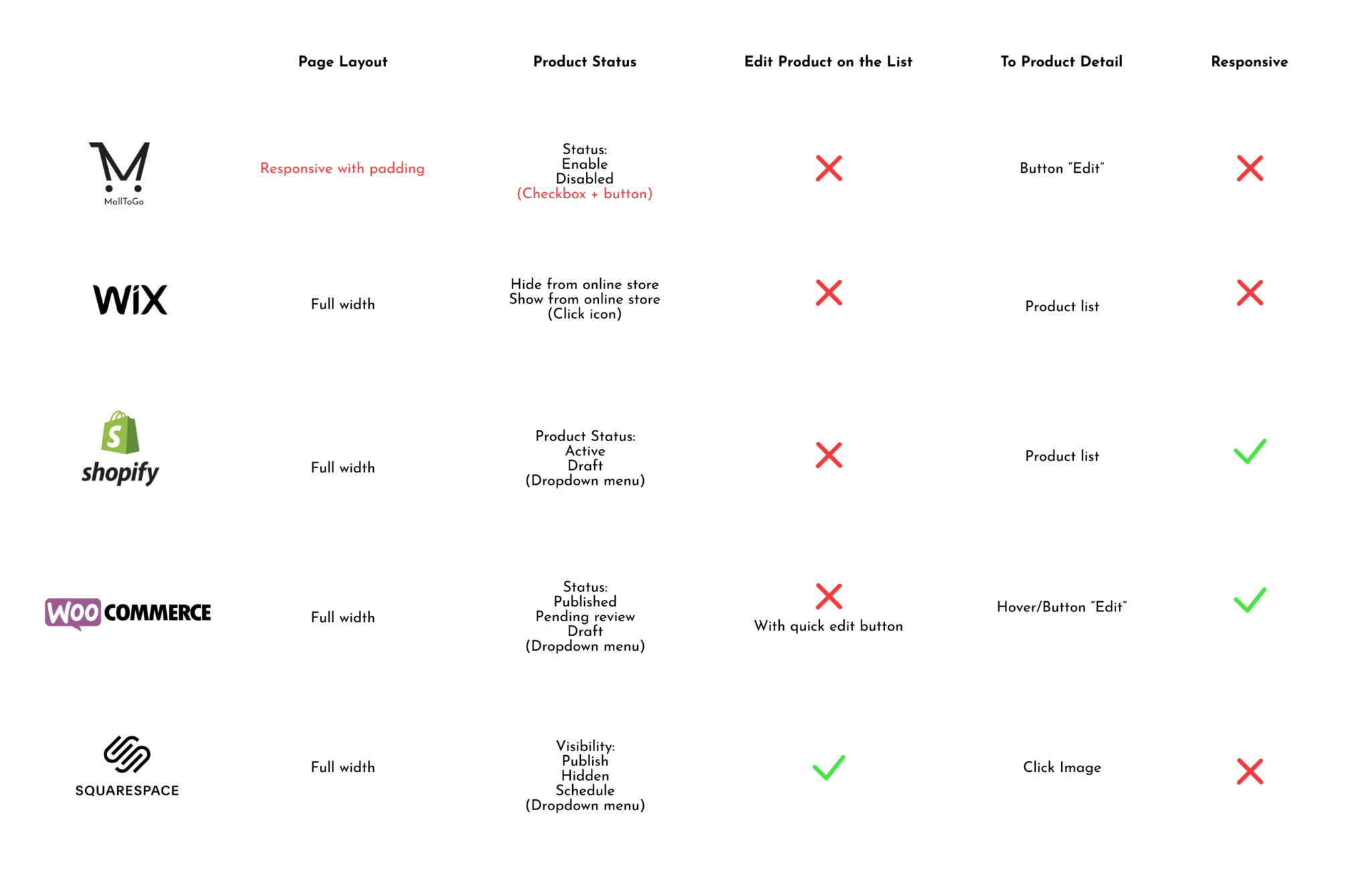
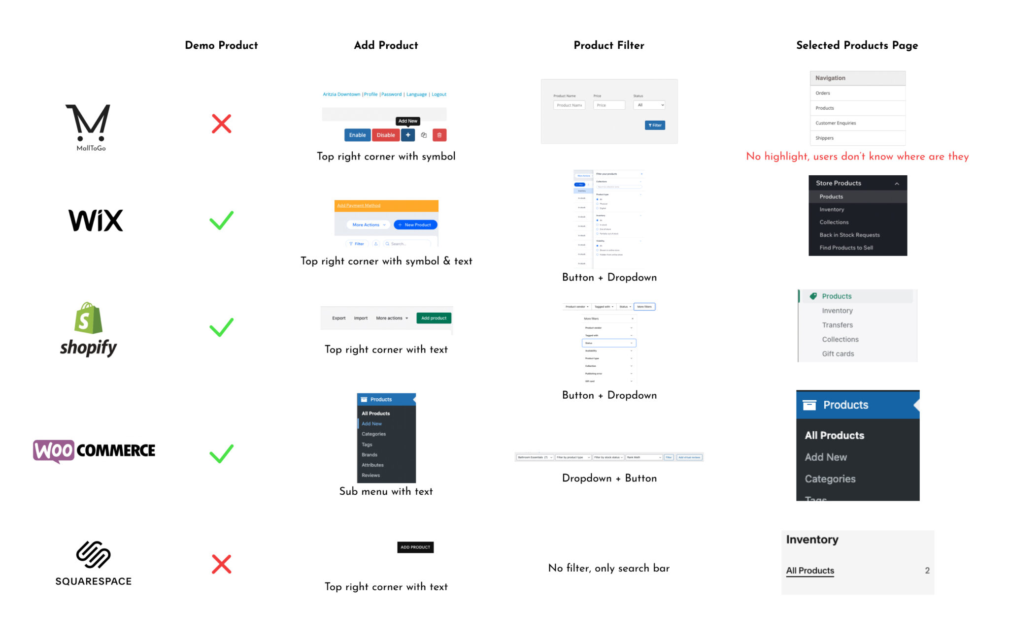
💡Action Driven Insights

“Add Product” Button: 

A common design pattern is used for this specific action is placing in the top right corner

Product Filter

It Misleads users’ attention on it and needs to be small and concise.

Media Sorting

A universal design pattern is to arrange the images by dragging. 

Menu Navigation

No page highlight, which goes against Jakob Nielsen’s principle of “recognition rather than recall.”

Information allocated in Tabs

Takes users a longer time when navigating basic information. A better approach is to consolidate information onto a single, scrollable page for greater efficiency.

Product Option Customization

The lack of options/variants and categories/collections customization goes against most vendors’ needs. 

User interview & testing current version

I conducted 30 mins long user interview with each local business owner with prepared questions, 

then let them explore the current product with a few tasks I assigned on the product page. 

The goal is to find out the good and bad things when using MallToGo and other platforms.

Warm up questions (To relax users, and build rapport and empathy):

  1. Tell me about your store’s background and why you want to set up an online shop ?

2. Do you work in the shop full-time?

3. Do you mind share with me some interesting stories when selling online?

4. What platforms do you use?

5. What is your biggest concern?

6. Tell me a little about your online selling routine in a day?

Main questions (Goal-oriented questions ):

7. Can you recall any difficulties when using other platforms?

8. What else you think other platform can improve?

9. What do you think about the product page in xxx?

10. How does it help you manage your inventory?

11. What features of the product page help you the most and why?

12. How efficient is the product page for you to manage?

End questions (To thank users and wrap up):

13. Anything you would like to add to this study?

Thank you so much for your time, let’s move on the the MallToGo Platform

Result:

Notable comments:

“How do I know what it looks like on my customer side.”

Wilson English

“Switching back and forth on those tabs is not convenient. ”

Alex Polo

“I wish I could customize the category, I sell different products.”

Emily Young

Flow diagrams

Before

After

Low fidelity wireframes

Extra features based on observation from usability testing

Quick Edit:

I noticed that users only needed to modify specific parts of product information, but the previous version required them to edit the entire product.

As a solution, I introduced a new quick edit feature to the platform, significantly increasing efficiency.

Storefront preview:
Users were uncertain about what to do after uploading a new product and were observed waiting for the screen to change. This reminded me of my experience with a competitor’s platform, where I hit the preview button without knowing what to do next.

It became evident that users were searching for a similar preview option.

High fidelity wireframes

After the low fidelity wireframes was finished, I started defining the fonts and colours.

Color palette

Primary, secondary,background,
success/checked, danger

Brand image enhancemence

I designed assets for enhancing brand image by combining the logo into the icon.

Font

Josefin Sans
Regular, Medium, Bold

AbBbCcDdEeFfGgHh

High fidelity wireframes

Prototype validation

Drag

60% (3 /5) of the users failed (2 took more than 5 seconds. 1 took more than 10 seconds) going to quick edit. They were hovering on the list item and clicking on it, but it was directed to the product detail page.

50% (2 / 5)of the users failed (took more than 6 seconds) to find “add variant” and “add category” in the quick edit in the first place and thought these were just plain text.

Drag

Challenges

  • Single designer: Being the only designer on the team allowed me to handle the entire redesign project, applying my research methods and design skills. Collaborating effectively with the developer and project manager was crucial. Immersing myself in the developer’s tools and technology also allowed me to gain a deeper understanding of the development process, which will enable me to provide more effective design solutions in the future.


  • Tight on the timeline: In the fast-paced environment of my 2-month contract with the company, I enhanced my time management skills under challenging time constraints.

What have I learned

Objective research can inform assumptions and hypotheses about a product or service (such as the Storefront Preview feature). By empathizing with users and identifying their hidden messages, feedback can be obtained earlier, and potential problems can be solved along the way (such as users needing a guide to download customer portal apps).

Summary

In my first SaaS project, I learned from a collaborative team and incorporated feedback from usability testing to make significant improvements. Our quick edit and store preview feature was highly rated by potential users, giving the team confidence to pursue future launches with enthusiasm.